Urban Quotient
Reflecting an architecture firm’s unique vision
- Strategy
- UX
- Design
- Development
- Animation
- Photography
- Collateral
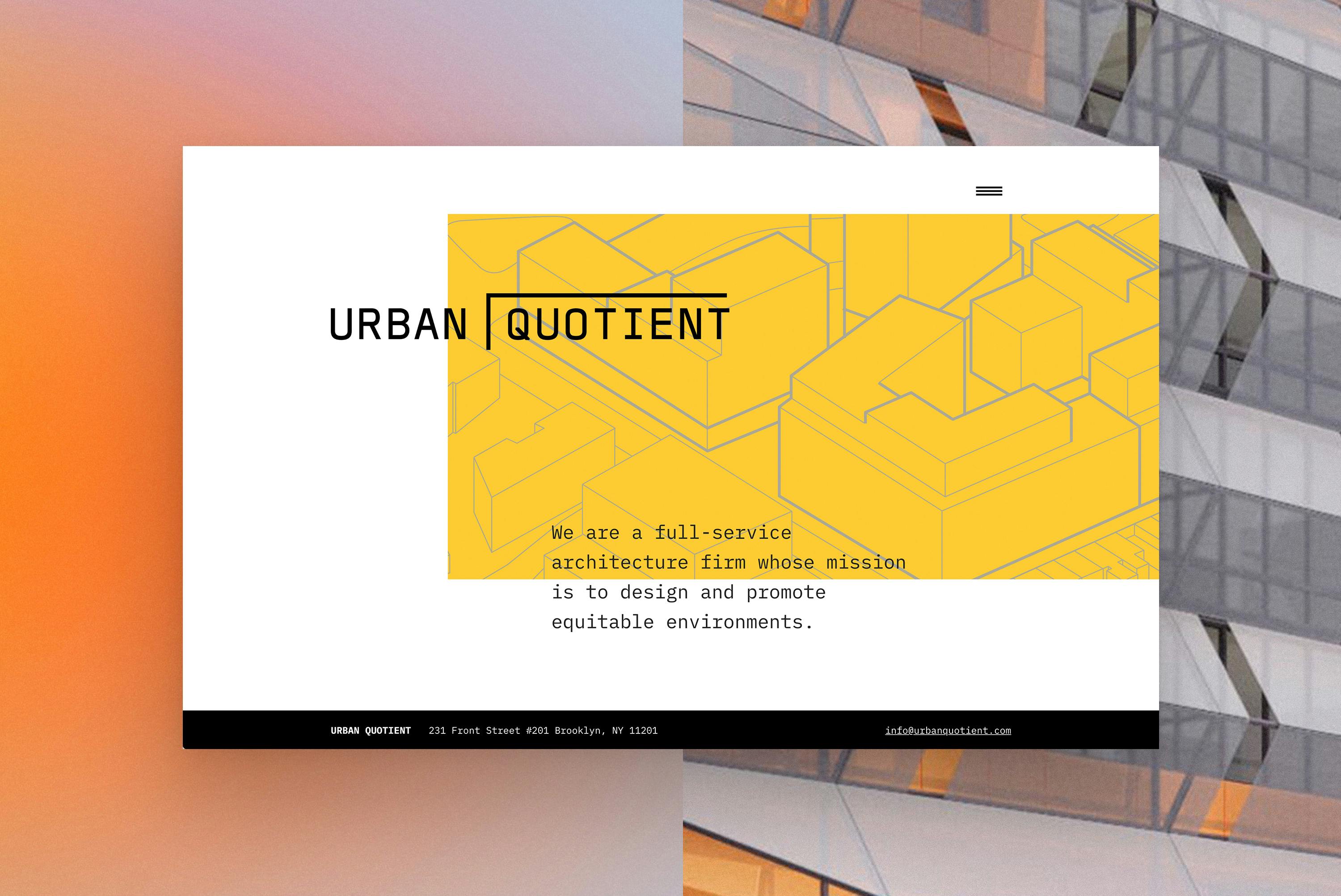
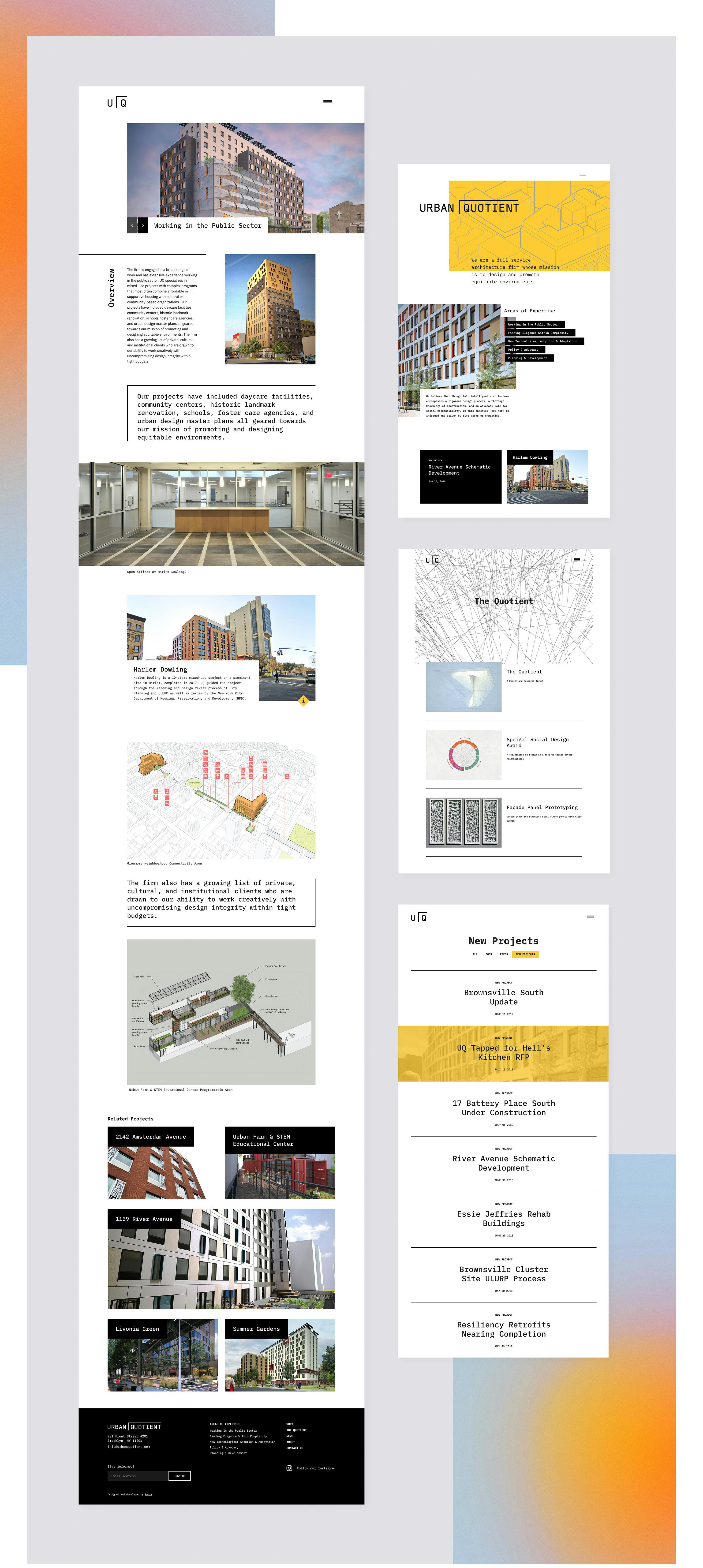
Urban Quotient turned to Ronik to reimagine their digital experience. Our solution is a flexible portfolio and presentation tool that allows the architecture firm’s storytelling and unique approach to shine through.
Visit siteOur creative process was guided by Urban Quotient’s human-centered ethos, their design process, and their existing brand identity. While the logo would remain, we connected elements of the firm’s approach with visual and interactive metaphors of the namesake “quotient” to create a new, distinctive design language.

To support the high quality case studies and assets, a customizable, modular Case Study template was implemented in the content management system. This structure allows content editors to quickly and intuitively build Case Study pages with a robust toolset of storytelling components that result in a cohesive yet organic feel.

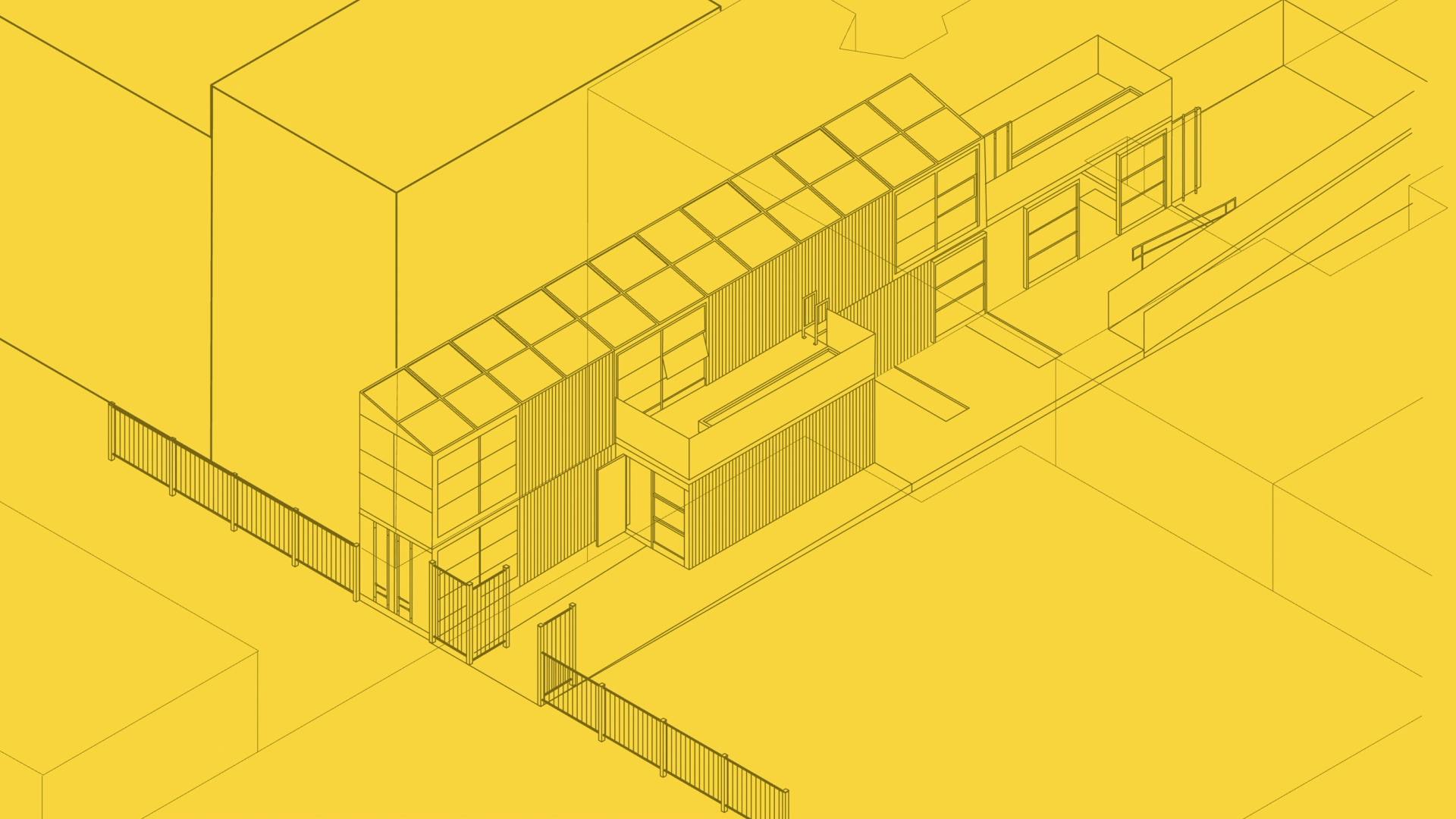
The logo—a sharp representation of the “quotient” concept—was given movement on the homepage to give it an active, adaptive feeling, changing from its full to symbolic form. For distinctive visual flair that speaks to the firm’s design process, we animated computational drawings taken directly from UQ projects, serving as the building block of the identity.
Up next
Council on Foreign Relations
Celebrating a Century: An Interactive History
